Colour Notes · 2026.06 · 28 min read
The Treachery of Black
A forensic history of colour in tailored menswear: why paintings, surviving suits, dye ledgers, and chemistry each lie in a different direction.
Share / 分享
Ready
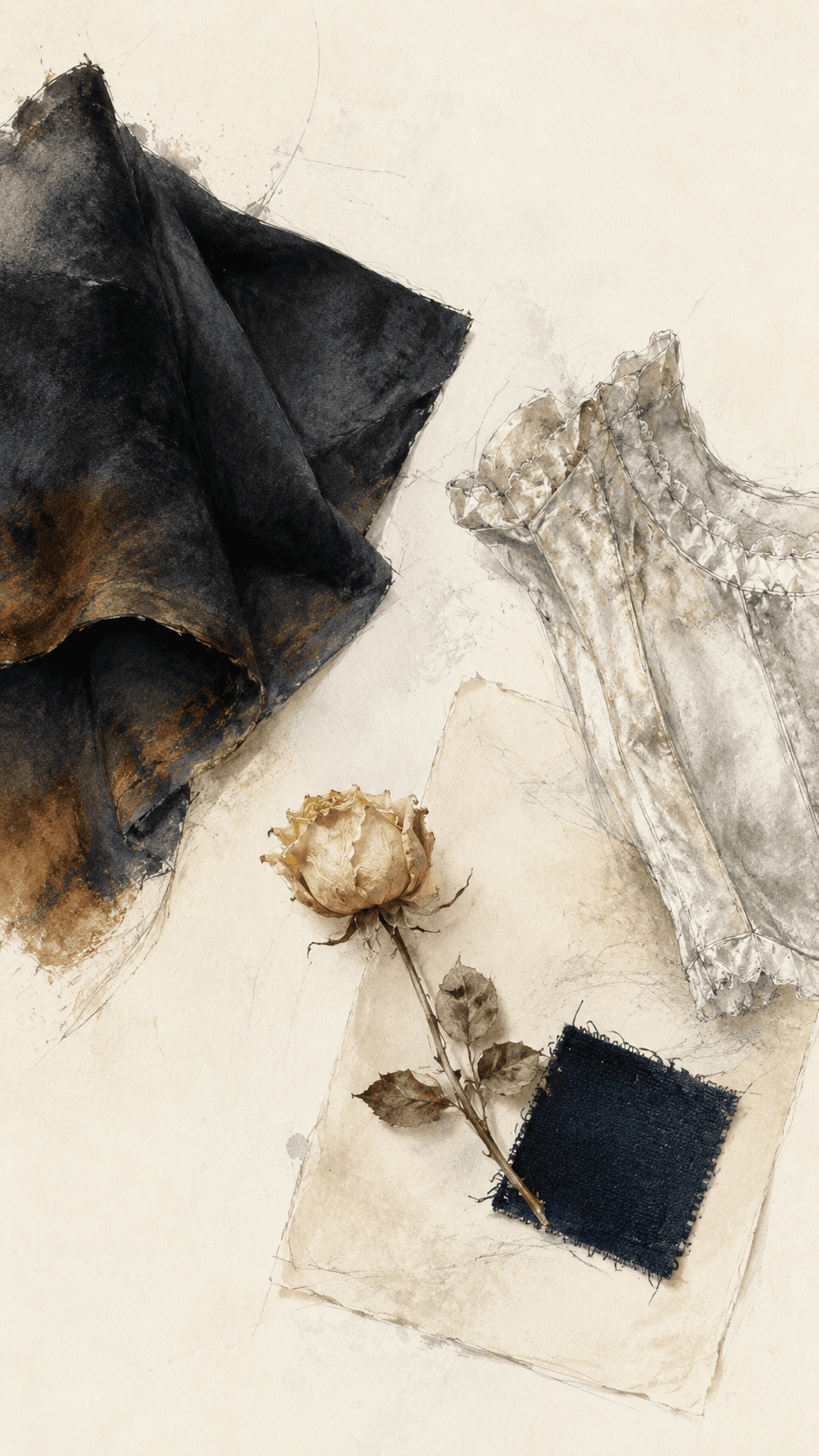
A forensic history of colour in tailored menswear, and why the painting, the surviving suit, the dyer's ledger, and the dye itself each tell a different lie.
On the morning of 20 June 1837, an eighteen-year-old woman received her Privy Council in mourning for the uncle whose throne she had just inherited. Those present recorded her dress as a deep, shimmering black. The painter David Wilkie, commissioned to immortalise the scene, put her in white, for effect. Victoria objected; she had, she pointedly recorded, been dressed in black, not white.
The dress survives. And if you go looking for it, you will find that both the queen and her painter were, in their way, wrong. It is not black now. It is not white. It is brown, a mottled, rusted sienna, the colour of a thing that has quietly become something else while no one was watching.
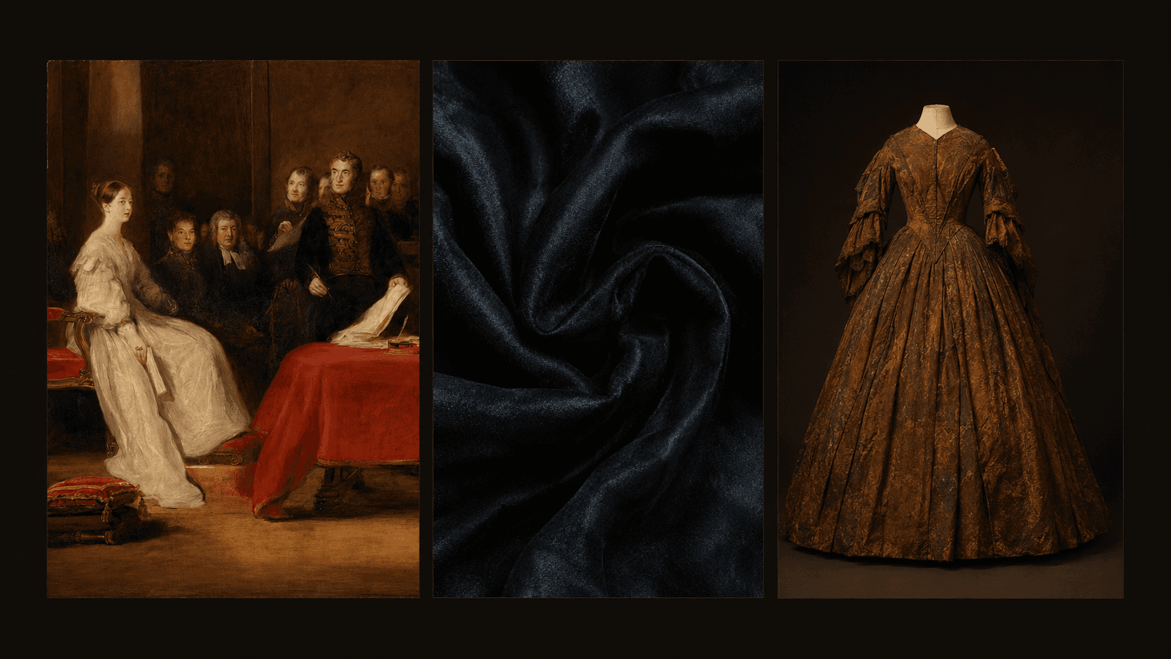
This is not the misfortune of one neglected garment. It is the fate of black itself, and it sets the central problem of any honest history of how men have dressed. Walk the same decade over to the menswear and you find the same trap waiting: the sober black frock coat, the uniform of the nineteenth-century gentleman, is browning in its archival box too, not by identical chemistry (wool is not silk, and one black recipe is not another) but by the same family of slow oxidations. So here is a question that sounds simple and is not: what colour was the suit, really?
You would think the answer lies in the obvious places, in the paintings, in the surviving clothes. It does not. Both are liars. The whole art of reconstructing the true palette of tailoring begins with accepting that every witness to the past distorts it, and that the distortions are the only thing we can trust.
Four witnesses, four lies
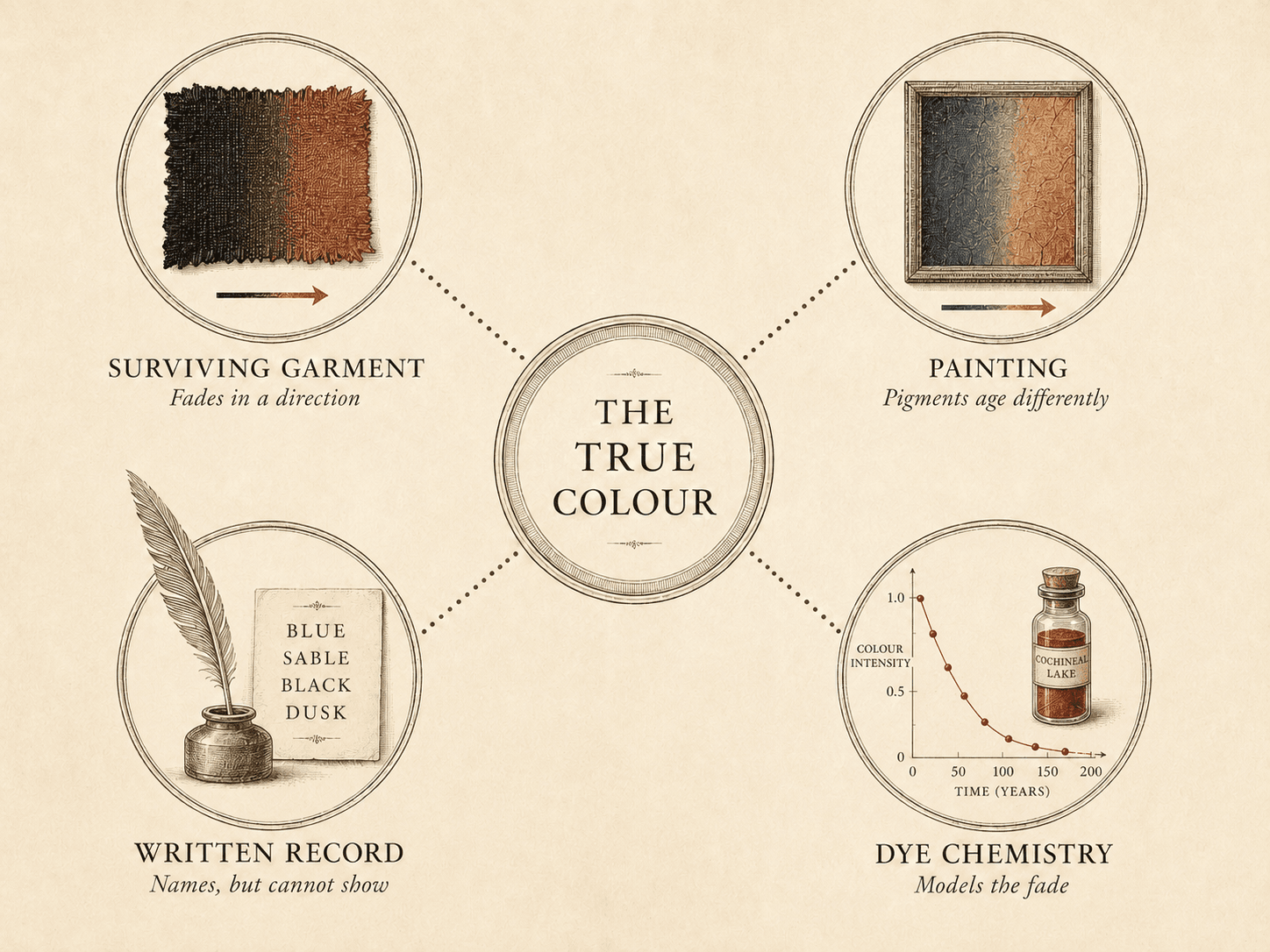
Reconstructing a historical colour is less like reading a document than running a murder trial in which every witness has a motive. There are four of them.
The surviving garment is the witness everyone believes and no one should. Dyes fade, and they do not fade randomly; they fade in a direction. A black goes rust. A purple collapses toward blue. A brilliant cochineal red drains to a ghost of itself. The cloth in the drawer is a faded photograph of a colour, not the colour.
The painting seems like the eyewitness, the man who was in the room. But the painter worked in pigments, and pigments have their own chemistry, unrelated to the dyes in the cloth they depict. A painted blue coat and a dyed blue coat age along entirely different curves. Worse, the painter had an agenda (composition, flattery, the moral weight of a dark tone) and would happily put a sitter in black he never owned, exactly as Wilkie put Victoria in white.
The written record (the dyer's recipe, the tailor's ledger, the sumptuary law, the period dictionary) cannot show you a colour at all, only name it. But names are evidence of perception, and that turns out to be priceless.
The dye chemistry is the forensic scientist: identify the colourant under the microscope, recreate the recipe, age it under lamps, and you can model the direction and rate of the fade as a vector.
Here is the trick, the entire method: because each witness lies in a known direction, two unreliable witnesses, properly cross-examined, constrain the truth more tightly than any single honest one ever could. It is error-correction. And it means the most valuable moment in the whole enterprise is not when the witnesses agree. It is when they contradict each other. That is where the colour actually was.
Nowhere is this richer, or more misunderstood, than in the one colour that built the modern man's wardrobe.
There was never one black
We talk about black as if it were a single thing, the absence at the bottom of the spectrum, the easy default. For most of the history of tailoring it was the opposite: the hardest, most expensive, most technically various colour a man could put on his back.
The myth begins in 1419, when Philip the Good, Duke of Burgundy, lost his father to an assassin's axe and went into a black so total it never came off. Under Philip, and then exported across Europe by the Spanish Habsburgs, black turned from the colour of grief into the colour of power, the administrative uniform of Charles V and Philip II, dominant for the better part of two centuries. The art historian José Luis Colomer has traced that arc precisely, from mourning to majesty.
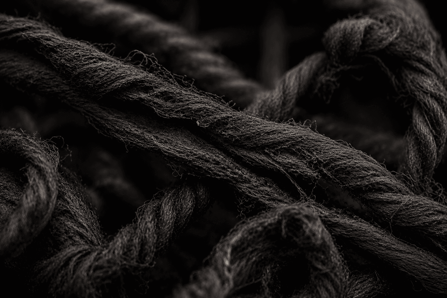
But "black" in that world was at least three different cloths, made three different ways, ageing three different directions. The richest (the one the Burgundian and Netherlandish guilds reserved for the finest wools, and prescribed from the Middle Ages clear to the end of the seventeenth century) was not dyed black at all. It was dyed blue. The cloth went first into a woad or indigo vat to a deep blue ground, then was over-dyed with a red mordant dye, usually madder, the two layers folding into a profound, slightly purplish black the period called "brunette." The second route was a tannin-and-iron black, built from things like alder-bark liquor and metal salts. The third, the cheap newcomer, was logwood (Haematoxylum campechianum, shipped out of Spanish-controlled Campeche), which gave an easy black on the cheap but a fugitive one, prone to fading, and only became a truly fast black two centuries later with the arrival of chrome mordants.

Two things follow from this, and both demolish a story you have probably been told.
First, the prestige black of the Habsburg court was a blue black, a thing of layered woad and madder, not a triumph of logwood. The cheap colonial dye gets the romantic press; the expensive cloth relied on the older, harder craft.
Second, and more damning: the popular line that "Spanish black" was a clever, cheap, durable miracle is chemically false. Iron blacks eat the cloth they colour. A 2012 study out of the University of Manchester and the British Museum put model iron-tannate dyes to the test and found they imparted not just a blue-grey colour but an immediate loss of tensile strength and a rise in surface acidity, the iron distributing itself through the fibre, the excess turning to sulphuric acid, the "hand" of silk and wool going harsh and brittle. The most authoritative blacks were, in the most literal sense, garments engaged in destroying themselves. The very richness that made them status was the richness that doomed them to the brown drawer. There is no better emblem for the whole subject: the colour of power was also a slow fire.
So when seventeenth-century Holland gives us those grave merchants by Frans Hals and Rembrandt, swathed in black against a fine white collar, the schoolbook reading (dour Calvinist gloom) is at best incomplete, and at worst backwards. Intense, even black on good cloth was one of the most labour-intensive and costly colours money could buy. Those men are not renouncing the world. They are flexing. The Dutch language itself records the truth: it had a small army of words for grades of dark, the zwart and swart that modify and subdivide, a vocabulary captured in Henry Hexham's pioneering English–Dutch dictionary of 1647. You do not develop a dozen words for black unless you can see, and pay for, a dozen blacks.
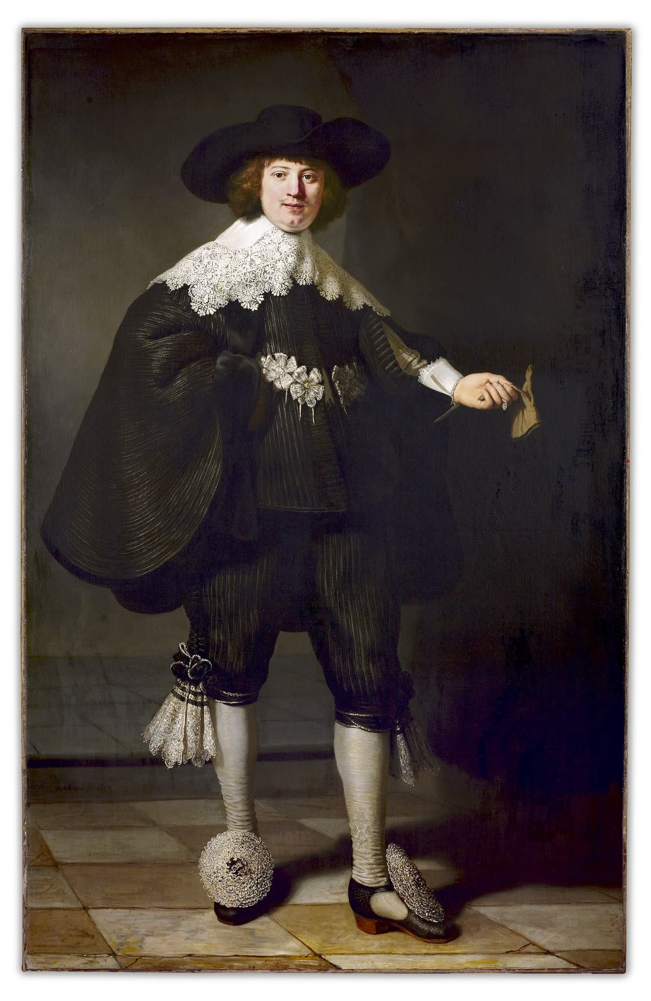
And the painters could see them too. Look closely at how a great seventeenth-century hand renders a black satin against a black wool in the same portrait: the satin throws sharp, near-white specular highlights; the wool drinks the light and gives almost nothing back. That distinction (the same dye, different surface, different colour to the eye) is the painted record of a perceptual fact that will, two hundred years later, become the entire grammar of bespoke tailoring.
The renunciation that wasn't
The single most repeated idea in menswear history is "The Great Masculine Renunciation": the moment, somewhere around 1800, when men supposedly abandoned colour, ornament and display, ceded all that frivolity to women, and retreated into the dark, plain, sober uniform we have worn ever since.
The phrase is real. It was coined in 1930 by the psychologist J. C. Flügel, in The Psychology of Clothes: Sartorially, he wrote, this event has surely the right to be considered as 'The Great Masculine Renunciation.' The phenomenon is real too. You can watch reflective silk and gold embroidery drain out of the elite male wardrobe and matte wool broadcloth flood in.
But almost everything popularly attached to it is wrong, and the corrections matter, because they change what the modern suit means.
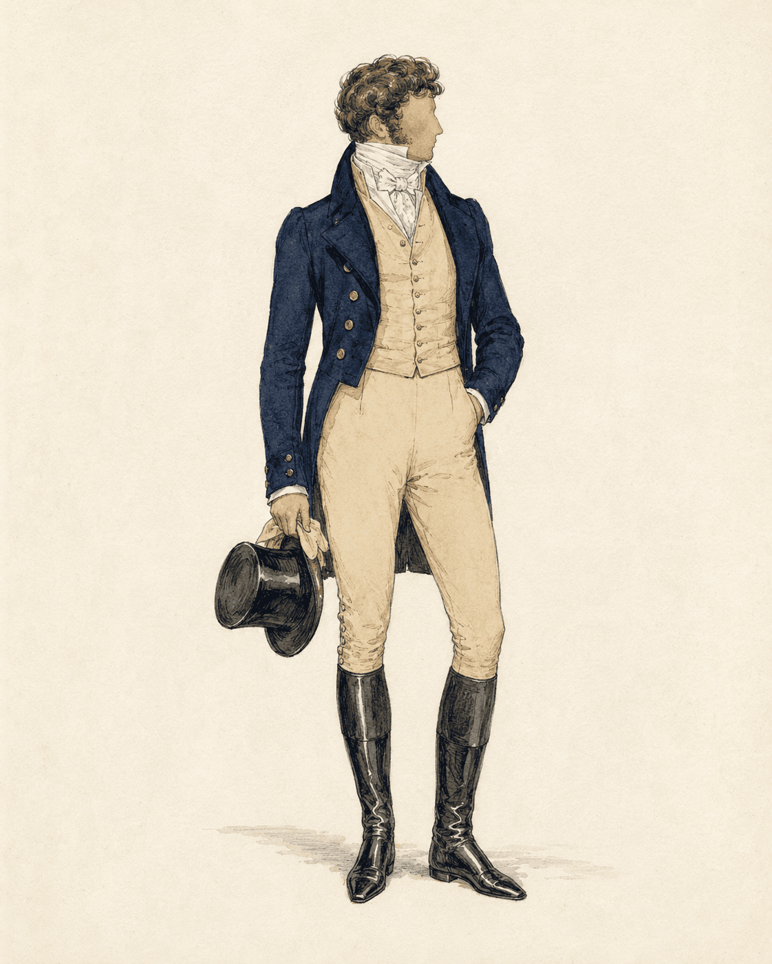
Take its patron saint. Beau Brummell did not dress in black. The Brummell uniform (the thing that reset masculine elegance around fit and cleanliness rather than colour and ornament) was a dark blue coat in a wool called Bath coating, a buff waistcoat, pale buckskins, gleaming boots, and immaculate white linen. The severe black-and-white we now think of as "classic" was evening dress, and it hardened into the rule somewhat later. The first act of the renunciation was not about black at all. It was about deep, quiet colour and, above all, about cut, the radical idea that the drama of a man's clothes should live in their architecture and the honest line of the body, not on their surface.
And the timing detonates the laziest version of the story. The renunciation is an Enlightenment-and-Revolution phenomenon of the 1780s to 1820s. The synthetic dye that supposedly drove men into hiding (more on it in a moment) does not arrive until 1856. You cannot explain a cause with an event that happens forty years after it. Whatever sent the gentleman into dark broadcloth, it was not cheap bright colour, because cheap bright colour did not yet exist.
Even Flügel's core claim has not aged well. Dress historians, Christopher Breward foremost among them, have spent decades pointing out that men did not renounce fashion. They retained a wider colour range than the legend allows, and (this is the crucial move) they relocated the competition. Display did not vanish. It went underground, into the things the untrained eye cannot read: the exact depth of a navy, the spring of a worsted, the rarity of a cloth, the millimetric correctness of a fit. The "renunciation" was a redeployment. The men who appeared to give up the game had simply changed it to one only they knew how to score.
Which is exactly the game we still play, and it has a name older than the suit.
How the rich went quiet
In 1856, an eighteen-year-old chemist named William Perkin, fishing for a synthetic treatment for malaria, fished out a sludge that stained silk an astonishing purple. He patented it that August (Patent No. 1984) for a purple the world would soon call mauve, and accidentally invented the modern chemical-dye industry. Within years, the brilliant purples, magentas and blues that had been the most expensive colours on earth, the prerogative of emperors and cardinals, could be had cheaply by anyone. Colour was democratised at a stroke.
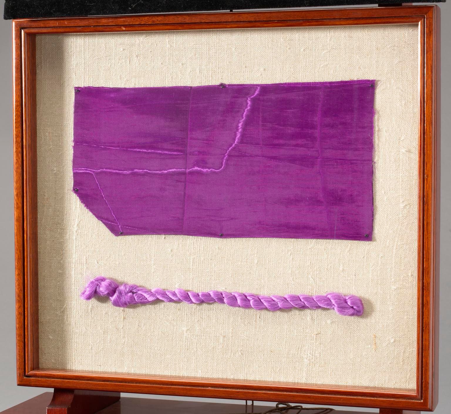
And here, at last, the dye chemistry and the social history meet on a single point, because the elite's response was immediate and revealing. They did what elites always do when a signal goes cheap: they moved the signal. The moment the clerk and the factory girl could wear vivid aniline mauve, vivid colour became common, and "common" is the one thing the distinguished cannot abide. So the affluent male wardrobe (and the most sophisticated womenswear of the Aesthetic Movement alongside it) withdrew into the un-buyable: into greys and olives and taupes and charcoals of microscopic complexity, into "indescribable tints" that announced their owner precisely by refusing to announce anything.
This is the deep engine of the dark suit, and it is worth naming its theory honestly rather than dressing it up as a fresh insight. Thorstein Veblen described its logic in 1899 as conspicuous consumption's subtler cousin; Pierre Bourdieu anatomised it in 1979 as distinction, the way the secure signal status through restraint, through codes legible only to insiders, through the studied refusal to try. The dark suit is the purest object lesson in the idea. Its whole power is that it looks like nothing to those who cannot read it, and like everything to those who can.
Which brings us to where all of this finally lives: not in the dye, but in the cloth.
The cloth that moves
Strip the bright colour out of a man's wardrobe and the eye does not stop wanting. It simply migrates, from hue to texture, weave, and light. This is the third great force in the story, the cognitive and perceptual one, and it is where bespoke tailoring becomes, frankly, more interesting than painting.
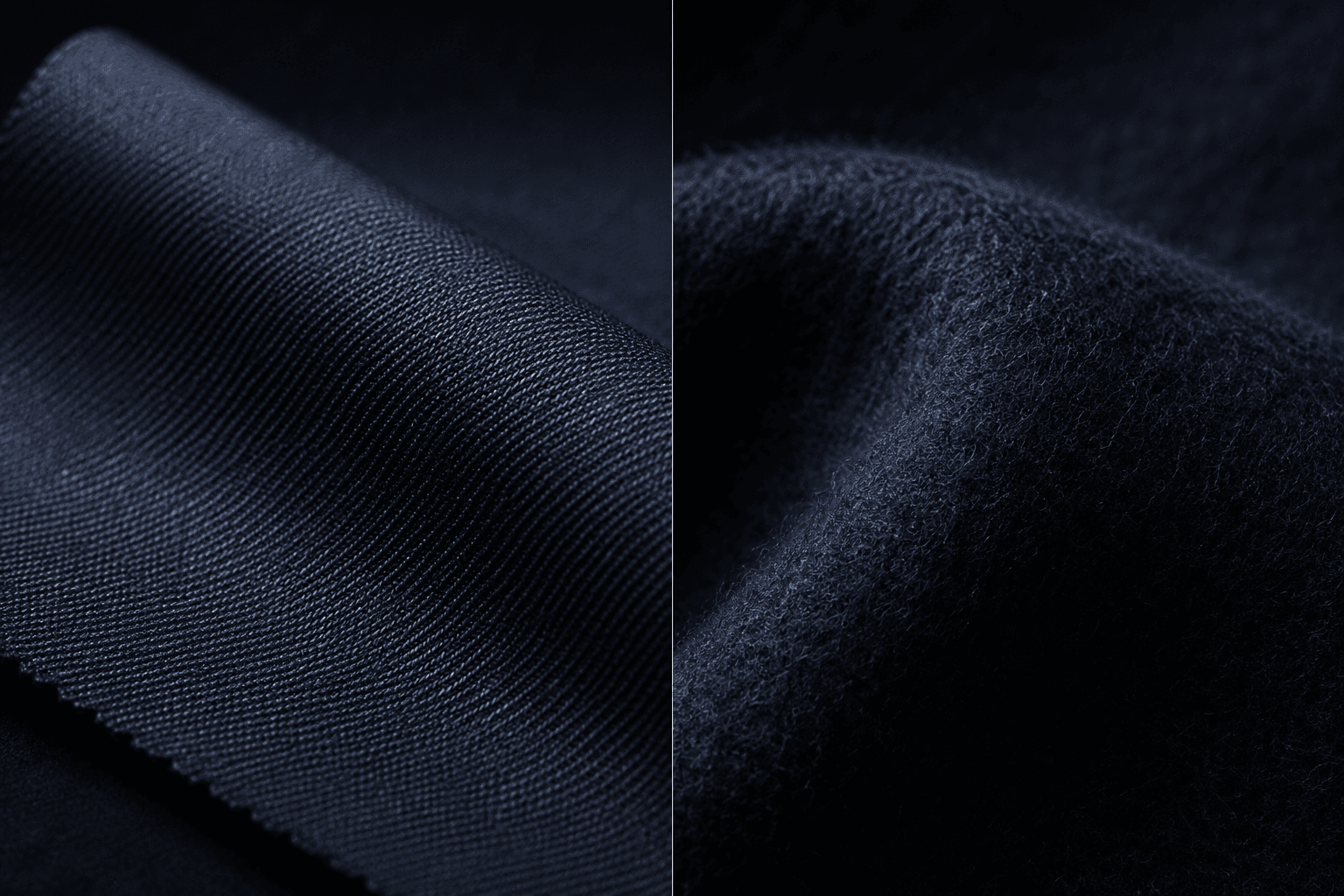
Consider that the same navy dye is two different colours depending on the cloth it lands in. Spun into a hard, smooth worsted, it reflects light in a crisp, formal, slightly severe register. Brushed into a soft woollen flannel, it goes hazy, approachable, full of shadow, the napped surface drinking light and blurring its own edges. Identical dye; opposite character. The tailor has done with finish what the seventeenth-century painter did with the satin and the wool: changed the colour without changing the colour.
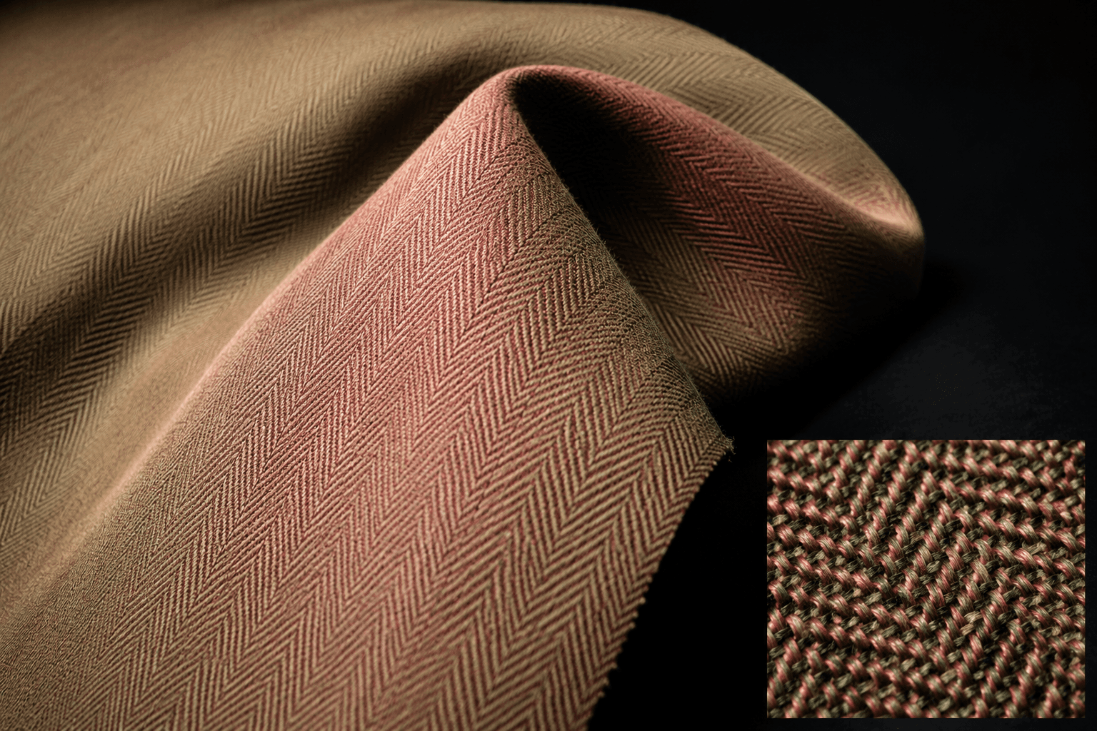
The connoisseur's ultimate expression of this is a cloth called Solaro, and its history is a small comedy. Around 1907 a doctor of tropical medicine, Louis Westenra Sambon, presented a fabric he was convinced would protect colonial Europeans from the sun's rays, a worsted woven with a khaki face and a brick-red underside, the red allegedly screening out dangerous light. The medical theory was nonsense; the cloth does nothing of the sort. But the optics were sublime. Woven that way, Solaro shimmers, earnest, earthy beige from a distance, a warm rose flush when it catches the light and the wearer moves. It is iridescent: a colour that changes as you look at it, a suit with weather inside it. It became, inevitably, a cloth of insiders (Gianni Agnelli wore it, his grandson Lapo Elkann after him), and "Solaro" survives as a trademark held today by Harrisons of Edinburgh. A failed sunscreen reborn as the most quietly theatrical cloth in tailoring.
Tweed performs the same magic by a different route. Up close, a fine tweed is a riot: flecks of brilliant, separately dyed wool, blue and rust and ochre and green, spun tight together. Step back and the eye fuses them into a single, deep, sober heather. It is Pointillism in worsted, Seurat woven instead of dabbed: a "muted" distance-colour built from anything but muted parts. The restraint is an illusion assembled, on close inspection, from riot.
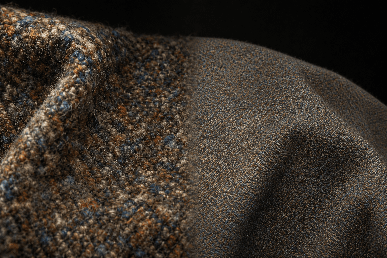
This is the real content of the phrase "quiet complexity." Not blandness. The opposite of blandness, visual interest pushed so deep into the structure of the cloth that it takes proximity, movement, and a trained eye to release it. The colour is still there. It has merely been hidden in the weave, exactly as the renouncing gentleman hid his vanity in his cut.
Catching the painting in a lie
So we return to the question (what colour was the suit, really?) and we can now answer it the only way it can honestly be answered: by catching the witnesses contradicting each other, and triangulating the truth in the gap.
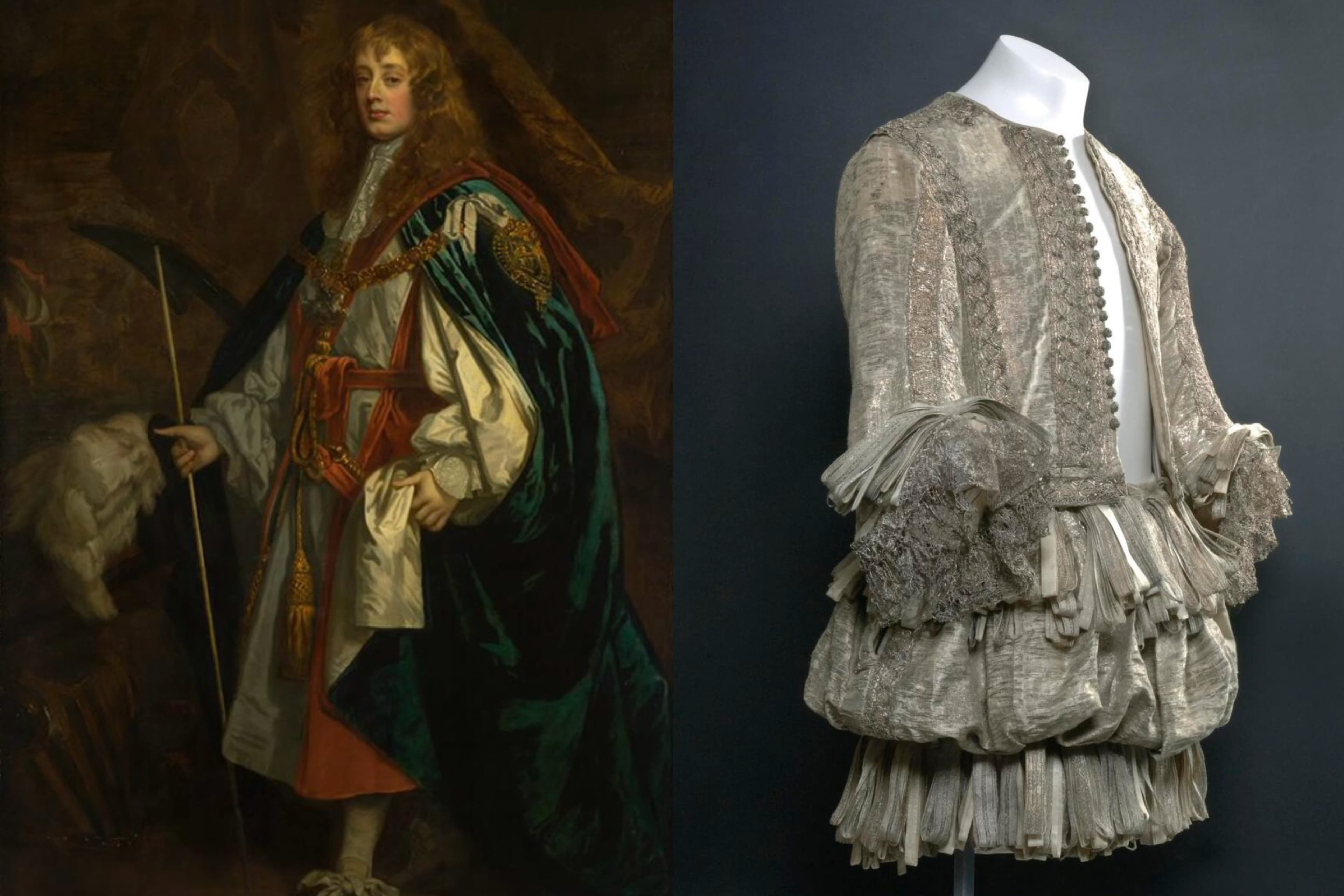
The cleanest case in all of menswear is a suit of silver. In the 1660s, Charles Stuart, Duke of Lennox and Richmond, was painted by Peter Lely in his Garter robes, gleaming in cloth of silver. That very suit (the doublet and trunk hose, dated to around 1665) survives at National Museums Scotland, accession A.1947.257, and survives is the operative word, because the metal has tarnished to a dull grey-brown. Here is the rare gift: the object and the dated portrait of the object, side by side. Lely's brush says radiant silver; the cloth in the case says brown. The gap between them is the painting's distortion, made measurable. Catch that vector once and you can use it to correct the painter's other work, to read his other sitters' clothes through a lens you have actually calibrated, rather than guessed at. Increasingly this is done in hard numbers, mapping surviving colour into the CIELAB colour space and expressing the distance between two readings as a vector, ΔE. (Honesty compels a caveat the breathless version omits: for the great anchor cases the discrepancy is still described qualitatively, tarnished versus radiant, not yet pinned to a published ΔE. The method is sound; the spreadsheet is incomplete.)
The same logic redeems the other liars. James II's wedding suit of 1673 survives at the V&A (T.711:1,2-1995) as a muted, brownish thing: catalogued, depending where you look, as grey wool broadcloth, or heather, lined with coral ribbed silk. That the descriptions cannot quite agree among themselves is the point: when dyes, fibres and three and a half centuries have all had their say, even the colour-words begin to wobble. A painted purple robe that now reads light blue is, nine times in ten, a red lake laid over blue whose red has simply died; the blue was always the survivor, not the intention. And in a degraded garment of the 1860s, the dull sienna of the exposed surface can hide, deep in a protected fold, the violent original violet: the precise trick that, on canvas, let conservators find van Gogh's true "deep, warm violet" preserved under the frame of a painting whose visible reds had faded to nothing.
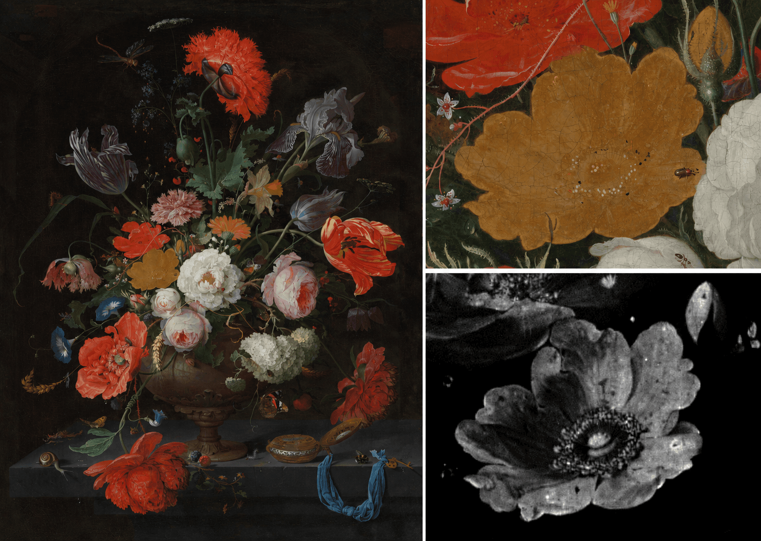
Even the painter's own materials confess. The blue called smalt greys and browns as it ages, which is why so many seventeenth-century blue coats are not the blue the sitter wore. Orpiment, the golden yellow, can oxidise and migrate clean out of a picture: the single yellow rose in Abraham Mignon's Still Life with Flowers and a Watch at the Rijksmuseum (SK-A-268) has flattened to a lifeless smear while the blooms around it stay vivid, its arsenic sulfide having turned to colourless arsenates that a 2022 imaging study at the museum traced ghosting through the petals. Indigo, by contrast, is comparatively tenacious, far more lightfast than the fugitive red lakes, which is part of why the humble blue of workwear weathers the centuries better than the cochineal of kings. Not that it is immortal: the indigo on a pair of jeans gives itself up happily enough to sun and washing, which is the entire romance of a worn-in denim. But set against the truly fugitive reds, blue endures, and there is a small democratic justice in that.
Coda: the loudest quiet
It is fashionable, as I write, to call all of this "quiet luxury": the navy and grey and camel, the logo-less cashmere, the suit that whispers. It would be a mistake to read it as an endpoint, the final mature form toward which menswear was always evolving. It is a trend, and a cyclical one: it crested around 2023 and 2024 and was already being pronounced dead in 2025, as these things always are, to make room for the next swing back toward colour and noise. The peacock will return. He always does.
But the longer history tells us something the trend cannot. The absence of bright colour in tailored menswear was never the absence of fashion, or of vanity, or of display. It was their most concentrated and disciplined form, vanity refined until only the initiated can detect it. We have spent two centuries reading the dark suit as the costume of restraint, the rational man, the renouncer. The dyer's vat and the tailor's cloth tell a louder story. The blue-black that was secretly built from woad and madder and slowly burning iron; the navy that changes character with the nap; the tweed that is a riot pretending to be a murmur; the Solaro that hides a rose inside a sober beige: these were never quiet at all. They were not silent; they were speaking in a frequency that took training, proximity, and money to hear.
The colour was always there. You just have to know that you cannot trust your eyes, and then you have to learn, witness by contradicting witness, how to see.
If you want to see the evidence
A short field guide to the objects behind this piece: all real, all locatable, several worth a detour.
Queen Victoria's 1837 accession dress. The Royal Collection. Recorded as shimmering black mourning; now rusted brown. The whole argument in a single garment.
The Lennox cloth-of-silver Garter suit, c. 1665. National Museums Scotland (A.1947.257), paired with Sir Peter Lely's portrait of the Duke in his Garter robes, c. 1668 (the prime version at Lennoxlove House; a studio copy at the North Carolina Museum of Art, Raleigh). The calibration anchor: tarnished cloth versus radiant paint.
James II's wedding suit, 1673. Victoria & Albert Museum (T.711:1,2-1995). Catalogued as grey (or heather) wool broadcloth lined with coral silk; now a muted brown. Bring a sceptical eye: even the museum's own colour-words don't quite agree.
Frans Hals and Rembrandt's black-clad burghers. The Rijksmuseum, Amsterdam, above all. Read the blacks as wealth, not gloom.
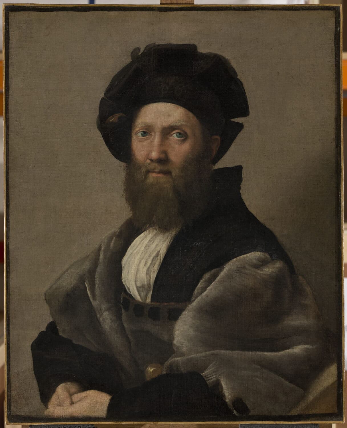
Raphael, Portrait of Baldassare Castiglione, c. 1514–15. The Louvre (INV 611). The painted manifesto of sprezzatura: an almost monochrome study in grey fur and discreet black, and the ancestor of every well-judged dark suit since.
Abraham Mignon, Still Life with Flowers and a Watch, c. 1660–79. The Rijksmuseum (SK-A-268). Find the single flat, lifeless yellow rose among the vivid blooms; its arsenic-yellow pigment is the colour that walked out of the painting.
Perkin's mauveine. The Science Museum, London. The accident that democratised colour and, perversely, sent the rich into the dark.
A note on sources, for the pedantic and the grateful: the dye-degradation findings draw on conservation science from the National Gallery, the Rijksmuseum and a 2012 Manchester/British Museum study of iron-tannate corrosion; the Burgundian blacks on the Burgundian Black Collaboratory's research; the renunciation on Flügel (1930) and its critics, chiefly Christopher Breward; and the social theory, named rather than borrowed, on Veblen and Bourdieu. Two small corrections worth carrying away, since they travel through the internet unchallenged: Baudelaire's image of the black coat as "la pelure du héros moderne" (the skin of the modern hero) comes from his Salon writing of 1845–46, not the later 1863 essay it is usually pinned to; and the much-loved symbolism of the Zhongshan suit's four pockets and five buttons is a retrospective legend, not documented design intent. The truth, as ever, is in the gap.
Atelier Saison
Bring colour into the conversation
The useful question is rarely whether a cloth is simply dark or light. It is how colour, surface, movement, and time will read on the body.
真正值得讨论的,不只是颜色深浅,而是颜色、布面、行动与时间如何一起落在身体上。